Building blocks
Building blocks, also known as snippets, are how users design and layout pages. They are important XML elements of your design.
The building blocks are classified into two types:
Structure blocks: visually used as „whole rows” and distributed into multiples categories (Intro, Columns, Content, Images, People, etc)
Inner Content blocks: used inside other building blocks
At the end of this chapter, you will be able to create custom snippets and to add them into a dedicated category.
File structure
The layout’s file structure is the following.
views
├── snippets
│   └── options.xml
│   └── s_snippet_name.xml
The styles» file structure is the following.
static
├── src
│   └── snippets
│       └── s_snippet_name
│           └── 000.js
│           └── 000.scss
│           └── 000.xml
│           └── options.js
Demo page
Demo data have to be installed to access this page:
https://your-database.com/website/demo/snippets
Layout
Snippets are editable by the user using the Website Builder. Some Bootstrap classes are important as they trigger some Website Builder options.
Wrapper
The standard main container of any snippet is a section. Any section element can be edited like a
block of content that you can move or duplicate.
<section class="s_snippet_name" data-name="..." data-snippet="...">
    <!-- Content -->
</section>
For inner content snippets, any other HTML tag can be used.
<div class="s_snippet_name" data-name="..." data-snippet="...">
    <!-- Content -->
</div>
Attribute |
Description |
|---|---|
class |
Unique class name for this snippet |
data-name |
Displayed in the right panel as the name of the snippet. If not found, it will fall back to Block. |
data-snippet |
Used by the system to identify the snippet |
The system automatically adds the data-name and data-snippet attributes during the drag and
drop based on the template’s name.
Figyelem
Those attributes should be specifically added when a snippet is declared on a theme page.
Figyelem
Avoid adding a section tag inside another section tag: this will trigger twice the Website
Builder’s options. You can use inner content snippets instead.
Javaslat
To write the content of a static page with standard snippets, there are two possible approaches:
- Pre-build the custom static pages with the Website Builder: Drag & drop snippets, then
copy/paste the code into your file and clean it up.
- Code everything directly: But beware of compatibility with the Website Builder. It
requires certain classes, names, id, data, etc. to work properly. A good practice is to seek out the snippets code created in standard code in the Odoo source files. Pay attention that the Website Builder sometimes adds classes to the snippets after dropped in the page.
Elements
There is a list of „features” we can enable/disable by using specific CSS classes.
Sizing
Any large Bootstrap columns directly descending from a .row element (respecting Bootstrap
structure) will be triggered by the Website Builder to make them resizable.
.row > .col-lg-*
Add padding on columns and <section>.
class="pt80 pb80"
Megjegyzés
pb* and pt* are the Odoo classes used to control the handlers. Their values are
increased by multiples of 8, till a max of 256 (0, 8, 16, 24, 32, 40, 48, …).
Enable the columns selector.
<div class="container s_allow_columns">
Disable the columns amount option.
<div class="row s_nb_column_fixed">
Disable the size option for all child columns.
<div class="row s_col_no_resize">
Disable the size option for one specific column.
<div class="col-lg-* s_col_no_resize">
Colors
Add a background based on the color palette for columns and <section>.
class="o_cc o_cc*"
Disable the background color option for all columns.
<div class="row s_col_no_bgcolor">
Disable the background color option of one specific column.
<div class="col-lg-* s_col_no_bgcolor">
Add a black color filter with an opacity of 50%.
<section>
    <div class="o_we_bg_filter bg-black-50"/>
    <div class="container">
        <!-- Content -->
    </div>
</section>
Add a white color filter with an opacity of 85%.
<section>
    <div class="o_we_bg_filter bg-white-85"/>
    <div class="container">
        <!-- Content -->
    </div>
</section>
Add a custom color filter.
<section>
    <div class="o_we_bg_filter" style="background-color: rgba(39, 110, 114, 0.54) !important;"/>
    <div class="container">
        <!-- Content -->
    </div>
</section>
Add a custom gradient filter.
<section>
    <div class="o_we_bg_filter" style="background-image: linear-gradient(135deg, rgba(255, 204, 51, 0.5) 0%, rgba(226, 51, 255, 0.5) 100%) !important;"/>
    <div class="container">
        <!-- Content -->
    </div>
</section>
Features
Non-editable areas
Make an element not editable.
<div class="o_not_editable">
Make an element not removable.
<div class="oe_unremovable">
Backgrounds
Add a background image and have it centered.
<div class="oe_img_bg o_bg_img_center" style="background-image: url('...')">
Add parallax effect.
<section class="parallax s_parallax_is_fixed s_parallax_no_overflow_hidden" data-scroll-background-ratio="1">
    <span class="s_parallax_bg oe_img_bg o_bg_img_center" style="background-image: url('...'); background-position: 50% 75%;"/>
    <div class="container">
        <!-- Content -->
    </div>
</section>
Megjegyzés
A video background can be set on a section. Refer to the „Media” chapter of this documentation.
Text highlights
Text highlights are SVG files that can be incorporated onto specific words or phrases to emphasize them. Text highlights offer customizable options for colors and thickness.

<h2>
   Title with
   <span class="o_text_highlight o_text_highlight_fill" style="--text-highlight-width: 10px !important; --text-highlight-color: #FFFF00;">
      <span class="o_text_highlight_item">
         highlighted text
         <svg fill="none" class="o_text_highlight_svg o_content_no_merge position-absolute overflow-visible top-0 start-0 w-100 h-100 pe-none">
            <!-- SVG path -->
         </svg>
      </span>
   </span>
</h2>
CSS custom property |
Description |
|---|---|
|
Thickness of the SVG borders |
|
Color of the SVG object |
Grid layout
Grid Layout is a powerful and flexible layout system in CSS that enables users to design complex building block layouts with ease.
Use
Enable the Grid Layout by adding the o_grid_mode CSS class on the row. The number of rows in
your grid is defined by the data-row-count attribute. The grid always contains 12 columns. The
grid gap, specified in the style attribute, determines the gaps (or gutters) between rows and
columns.
<div class="row o_grid_mode" data-row-count="13" style="gap: 20px 10px">
   <!-- Content -->
</div>
Items in a grid
Add items in the grid with the o_grid_item class. If the grid item contains an image, use the
o_grid_item_image class.
<div class="row o_grid_mode" data-row-count="13">
   <div class="o_grid_item g-height-* g-col-lg-*" style="grid-area: 2 / 1 / 7 / 8; z-index: 3;">
      <!-- Content -->
   </div>
   <div class="o_grid_item o_grid_item_image g-height-* g-col-lg-*" style="grid-area: 1 / 6 / 9 / 13; z-index: 2;">
      <img src="..." alt="..." >
   </div>
</div>
The dimensions and position of a grid item are defined by the grid-area that can be explicitly set
in the style attribute along with the z-index.
The g-height-* and g-col-lg-* classes are generated by the Website Builder for editing purposes.
Grid item padding
<div class="row o_grid_mode" data-row-count="13" style="gap: 20px 10px;">
   <div class="o_grid_item g-height-* g-col-lg-*" style="--grid-item-padding-y: 20px; --grid-item-padding-x: 15px; grid-area: 2 / 1 / 7 / 8; z-index: 3;">
      <!-- Content -->
   </div>
</div>
CSS custom property |
Description |
|---|---|
|
Vertical paddings (Y axis) |
|
Horizontal paddings (X axis) |
Compatibility system
- When a snippet has a
data-vcss,data-vjsand/ordata-vxmlattribute, it means it is an updated version, not the original one.
<section class="s_snippet_name" data-vcss="001" data-vxml="001" data-js="001">
    <!-- Content -->
</section>
These data attributes indicate to the system which file version to load for that
snippet (e.g., 001.js, 002.scss).
Custom snippet
Some more specific needs will require the creation of custom snippets. Here is how to create a custom snippet/
Template
Create first the snippet template. Then, add it to the list and make it available via the Website Builder.
1. Declaration
First, create the template of the custom snippet:
/website_airproof/views/snippets/s_airproof_snippet.xml¶<?xml version="1.0" encoding="utf-8"?>
<odoo>
<template id="s_airproof_snippet" name="...">
<section class="s_airproof_snippet">
<!-- Content -->
</section>
</template>
</odoo>
Figyelem
data-name and data-snippet attributes have to be specified when a snippet is declared on a
theme page. Otherwise, the snippet won’t be recognised by the Website Builder and issues might
occur whenever a database upgrade is done. Additionally, remember that the name attribute is
shown as the name of your custom snippet in the Blocks section of the options panel.
Javaslat
Use Bootstrap native classes as much as possible.
Prefix all your custom classes.
Use underscore lowercase notation to name classes, e.g.,
.x_nav,.x_nav_item.Avoid using ID attribute within your
sectionas several instances of a snippet may appear throughout the page (An ID attribute has to be unique on a page).
Add the custom snippet to the list of standard snippets, so the user can drag and drop it on the page, directly from the edit panel.
2. Group creation
Add a group at the top of the list (feel free to put it where needed in this list).
/website_airproof/views/snippets/options.xml¶<template id="snippets" inherit_id="website.snippets" name="Airproof - Snippets">
<!-- Create the group -->
<xpath expr="//snippets[@id='snippet_groups']/*[1]" position="before">
<t snippet-group="airproof" t-snippet="website.s_snippet_group" string="Airproof" t-thumbnail="/website_airproof/static/src/img/wbuilder/s_airproof_group_thumbnail.svg"/>
</xpath>
</template>
Attribute |
Description |
|---|---|
snippet-group |
ID of the group |
t-snippet |
Inherited template ID |
string |
Group name displayed to the users |
t-thumbnail |
The path to the thumbnail of the group |
3. Snippet addition
Then add the custom snippet into the <snippets id="snippet_structure"> which contains
all existing ones on the same level. The Website Builder will split them automatically into
categories by reading the group attribute on the <t t-snippet="">
/website_airproof/views/snippets/options.xml¶<template id="snippets" inherit_id="website.snippets" name="Airproof - Snippets">
<!-- Create the group -->
<xpath expr="//snippets[@id='snippet_groups']/*[1]" position="before">
<t snippet-group="airproof" t-snippet="website.s_snippet_group" string="Airproof" t-thumbnail="/website_airproof/static/src/img/wbuilder/s_airproof_group_thumbnail.svg"/>
</xpath>
<!-- Add the custom snippet to the group -->
<xpath expr="//snippets[@id='snippet_structure']/*[1]" position="before">
<t t-snippet="website_airproof.s_airproof_snippet" string="Custom snippet" group="airproof">
<keywords>Snippet</keywords>
</t>
</xpath>
</template>
Attribute |
Description |
|---|---|
t-snippet |
The snippet template to use |
group |
The group in which the snippet is added. |
<keywords> |
Keywords entered by the user in the search field in the Snippets panel |
Inner content snippet
To make a custom snippet appearing in the Inner content list, add it to the snippet_content
instead:
/website_airproof/views/snippets/options.xml¶<template id="snippets" inherit_id="website.snippets" name="Airproof - Snippets">
<!-- Add the custom snippet to the group -->
<xpath expr="//snippets[@id='snippet_content']/*[1]" position="before">
<t t-snippet="website_airproof.s_airproof_snippet" string="Custom snippet" t-thumbnail="/website_airproof/static/src/img/wbuilder/s_airproof_snippet.svg" />
</xpath>
</template>
Fontos
Don’t forget to add a
t-thumbnailand remove thegroupattribute as this kind of building blocks is directly available in the right options panel of the Website Builder.Don’t forget to add the snippet to the list of all available „Inner content” snippets.
Options
Options allow users to edit a snippet’s appearance/behavior using the Website Builder. You can create snippet options easily and automatically add them to the Website Builder.
Lásd még
Template
There are a bunch of commands to set the options of a custom snippet. These options can be created
into /website_airproof/views/snippets/s_airproof_snippet.xml.
/website_airproof/views/snippets/s_airproof_snippet.xml¶<template id="s_airproof_snippet_options" inherit_id="website.snippet_options" name="Airproof - Snippets Options">
<xpath expr="." position="inside">
<!-- Options -->
</xpath>
</template>
Then insert the different available options:
/website_airproof/views/snippets/s_airproof_snippet.xml¶<template id="s_airproof_snippet_options" inherit_id="website.snippet_options" name="Airproof - Snippets Options">
<xpath expr="." position="inside">
<div data-selector=".s_airproof_snippet">
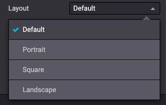
<we-select string="Layout">
<we-button data-select-class="">Default</we-button>
<we-button data-select-class="s_airproof_snippet_portrait">Portrait</we-button>
<we-button data-select-class="s_airproof_snippet_square">Square</we-button>
<we-button data-select-class="s_airproof_snippet_landscape">Landscape</we-button>
</we-select>
<we-title>Space</we-title>
<we-button-group string="Before">
<we-button data-select-class="mt-0">1</we-button>
<we-button data-select-class="mt-3">2</we-button>
<we-button data-select-class="mt-5">3</we-button>
</we-button-group>
</div>
</xpath>
</template>
Inner content
Make a custom snippet „inner content” (droppable in an other building block) by extending the
so_content_addition_selector variable which contains all CSS selectors referring to the existing
inner content building blocks:
/website_airproof/views/snippets/options.xml¶<template id="snippet_options" inherit_id="website.snippet_options" name="Airproof - Snippets Options">
<xpath expr="//t[@t-set='so_content_addition_selector']" position="after">
<t t-set="so_content_addition_selector"
t-value="so_content_addition_selector + ', .s_airproof_snippet'" />
</xpath>
</template>
Binding
These options use CSS selectors (class, XML tag, id, etc).
data-selector
Options are wrapped in groups. Groups can have properties that define how the included options interact with the user interface.
data-selector binds all the options included in the group to a particular element matching the
selector value (CSS class, ID, etc). The option will appear when the matching selector is selected.
<div data-selector="section, h1, .custom_class, #custom_id">
It can be used in combination with other attributes like data-target, data-exclude or
data-apply-to.
data-target
data-target="" allows to apply the option to a child element of the data-selector="".
<div
   data-selector=".s_airproof_snippet"
   data-target=".row">
data-exclude
data-exclude="" allows to exclude some particular selectors from the rule.
<ul> tag (without .navbar-nav class) is selected¶<div
data-selector="ul"
data-exclude=".navbar-nav">
data-drop-in
data-drop-in defines the list of elements where the snippet can be dropped into.
<div data-selector=".s_airproof_snippet" data-drop-in=".x_custom_location">
data-drop-near
data-drop-near defines the list of elements where the snippet can be dropped beside.
<div data-selector=".s_airproof_snippet_card" data-drop-near=".card">
data-js
data-js binds a custom JavaScript methods.
<div data-selector=".s_airproof_snippet" data-js="CustomMethodName">
Layout & fields
<we-title>
Add titles between options to categorize them.
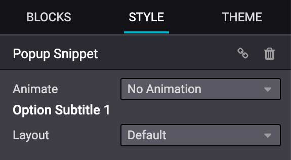
<we-title>Option subtitle 1</we-title>
<we-row>
Create a row in which elements is displayed next to each other.
<we-row string="My option">
   <we-select>...</we-select>
   <we-button-group>...</we-button-group>
</we-row>
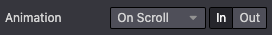
The perfect example for this case is the Animation row:
<we-button>
This tag is used inside <we-select> and <we-button-group>.
<we-button-group string="Before">
   <we-button data-select-class="mt-0">1</we-button>
   <we-button data-select-class="mt-3">2</we-button>
   <we-button data-select-class="mt-5">3</we-button>
</we-button-group>
Add data-select-class="" to indicate which class is added to the targeted element when this
choice is selected. Like any XML node, add other attributes allows to improve the style and/or the
user experience.
<we-button
   class="fa fa-fw fa-angle-double-right"
   title="Move to last"
   data-position="last" />

<we-select>
Formats the option as a dropdown list. Add string="" to indicate the field name.
<we-select string="Layout">...</we-select>
<we-button-group>
Formats the option as buttons next to each other.
<we-button-group string="Before">...</we-button-group>

<we-checkbox>
Formats the option as a toggle switch.
<we-checkbox
   string="Tooltip"
   data-select-class="s_airproof_snippet_tooltip" />

<we-range>
Formats the option as a slider.
<we-range
   string="Images Spacing"
   data-select-class="o_spc-none|o_spc-small|o_spc-medium|o_spc-big" />
Each step of the range is separated by a |. Here, each class name corresponds to a step.

<we-input>
Formats the option as a text field.
data-unit, data-save-unit and data-step are optional¶<we-input
string="Speed"
data-unit="s"
data-save-unit="ms"
data-step="0.1" />

<we-input> comes with optional attributes particularly useful in specific case:
Attribute |
Description |
|---|---|
|
Shows the expected unit of measure. |
|
Set the unit of measure to which the value entered by the user is converted and saved. |
|
Set the numerical value by which the field can be incremented. |
<we-colorpicker>
Formats the option as a color/gradient to choose from.
<we-colorpicker
   string="Color filter"
   data-select-style="true"
   data-css-property="background-color"
   data-color-prefix="bg-"
   data-apply-to=".s_map_color_filter" />

Attribute |
Description |
|---|---|
|
Refers to |
|
Define the CSS property targeted by the colorpicker. |
|
Define the prefix applied to the CSS class returned. |
|
Set the element on which the color is applied. |
Methods
Beside binding options allowing to select, target or exclude an element. Option fields have several useful data attributes refering to standard JavaScript methods.
For example, data-select-class refers to the JavaScript method named selectClass.
Built-in methods
Selection
There are several built-in methods available. They are callable by using the related data attribute directly into the XML template.
Data attributes |
Description |
|---|---|
|
Allows to select one and only one class in the option classes set and set it on the associated snippet. |
|
Allows to select a value and set it on the associated snippet as an attribute. The attribute
name is given by the |
|
Allows to select a value and set it on the associated snippet as a property. The attribute
name is given by the |
|
Allows to select a value and set it on the associated snippet as a CSS style. The attribute
name is given by the |
|
Enable the selection of a color palette.
Only for |
Events
There are also built-in methods directly linked to events the Website Builder listens to:
Name |
Description |
|---|---|
start |
Occurs when the publisher selects the snippet for the first time in an editing session or when the snippet is drag-and-dropped on the page. |
destroy |
Occurs after the publisher has saved the page. |
onFocus |
Occurs each time the snippet is selected by the user or when the snippet is drag-and-dropped on the page. |
onBlur |
Occurs when a snippet loses focus. |
onClone |
Occurs just after a snippet is duplicated. |
onRemove |
Occurs just before the snippet is removed. |
onBuilt |
Occurs just after the snippet is drag-and-dropped on a drop zone. When this event is triggered, the content is already inserted in the page. |
cleanForSave |
Occurs before the publisher saves the page. |
Custom methods
To create custom JavaScript methods, a link between the options group and the custom methods has to
be created. To do so, a JavaScript class has to be created and called in the XML template with
data-js.
Add the data-js attribute to your options group:
<template id="s_airproof_snippet_options" inherit_id="website.snippet_options" name="Airproof - Snippets Options">
   <xpath expr="." position="inside">
      <div data-selector=".s_airproof_snippet" data-js="airproofSnippet">
         // Options
      </div>
   </xpath>
</template>
Then, the class can be created in a JavaScript file:
/website_airproof/static/src/s_airproof_snippet/options.js¶/** @odoo-module */
import options from 'web_editor.snippets.options';
const AirproofSnippet = options.Class.extend({
// Built-in method example
start: function() {
//...
}
// Custom method example
customMethodName: function() {
//...
}
});
options.registry.AirproofSnippet = AirproofSnippet;
export default AirproofSnippet;
Finally, the custom method can be called on your custom option through the XML template:
<template id="s_airproof_snippet_options" inherit_id="website.snippet_options" name="Airproof - Snippets Options">
   <xpath expr="." position="inside">
      <div data-selector=".s_airproof_snippet" data-js="airproofSnippet">
         <we-checkbox data-custom-method-name="" />
      </div>
   </xpath>
</template>
Dynamic Content templates
By default, Dynamic Content blocks have a selection of templates available in the Website Builder. Custom templates can also be added to the list automatically by use the same naming convention for the template id attribute.
Call the template
The selected dynamic snippet replace the <div class="dynamic_snippet_template"/> placeholder by
the right template based on the data-template-key and the custom CSS class:
<section
   data-snippet="s_blog_posts"
   data-name="Blog Posts"
   class="s_blog_post_airproof s_dynamic_snippet_blog_posts s_blog_posts_effect_marley s_dynamic pb32 o_cc o_cc2 o_dynamic_empty"
   data-template-key="website_airproof.dynamic_filter_template_blog_post_airproof"
   data-filter-by-blog-id="-1"
   data-number-of-records="3"
   data-number-of-elements="3"
>
   <div class="container o_not_editable">
      <div class="css_non_editable_mode_hidden">
            <div class="missing_option_warning alert alert-info rounded-0 fade show d-none d-print-none">
               Your Dynamic Snippet will be displayed here... This message is displayed because you did not provided both a filter and a template to use.<br/>
            </div>
      </div>
      <div class="dynamic_snippet_template"/>
   </div>
</section>
Examples
/website_airproof/views/snippets/options.xml¶<template id="dynamic_filter_template_blog_post_airproof" name="...">
<div t-foreach="records" t-as="data" class="s_blog_posts_post">
<t t-set="record" t-value="data['_record']"/>
<!-- Content -->
</div>
</template>
Attribute |
Description |
|---|---|
id |
The ID of the template. Has to start with |
name |
Human-readable name of the template |
/website_airproof/views/snippets/options.xml¶<template id="dynamic_filter_template_product_product_airproof" name="...">
<t t-foreach="records" t-as="data" data-number-of-elements="4" data-number-of-elements-sm="1" data-number-of-elements-fetch="8">
<t t-set="record" t-value="data['_record']"/>
<!-- Content -->
</t>
</template>
Attribute |
Description |
|---|---|
id |
The ID of the template. Has to start with |
name |
Human-readable name of the template |
data-number-of-elements |
Number of products per slide on desktop |
data-number-of-elements-sm |
Number of products per slide on mobile |
data-number-of-elements-fetch |
The total amount of fetched products |
/website_airproof/views/snippets/options.xml¶<template id="dynamic_filter_template_event_event_airproof" name="...">
<div t-foreach="records" t-as="data" class="s_events_event">
<t t-set="record" t-value="data['_record']._set_tz_context()"/>
<!-- Content -->
</div>
</template>
Attribute |
Description |
|---|---|
id |
The ID of the template. Has to start with |
name |
Human-readable name of the template |